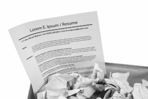
You Only Have 7 Seconds To Make a Lasting Impression
Picture having to quickly review a mountain of resumes from hundreds of qualified candidates, and you’ll understand why a skimmable resume is so important.
Tech hiring managers who need to fill a position as soon as possible need to be able to find what they’re looking for with as minimal time and effort as possible. This includes information about a person’s background, skills, and qualifications. Hiring managers have to figure out who will get another look and who will get the brush-off in a matter of seconds.
In fact, eye-tracking research shows that recruiters and hiring managers only spend an average of seven seconds reviewing a resume. If your resume is a dense wall of words, with long paragraphs and sentences that go on forever, in the tiniest font you can find, your resume won’t be worth the paper it’s printed on or the data plan that transmitted it.
How can you give yourself the best chance of getting to the next stage in the screening process? Use your resume to distinguish yourself from the other talented tech professionals trying to score the same job. But to be effective in setting you apart from the competition, your resume must make the reviewer’s job easier. That means a skimmable resume that is easy to read and puts the most relevant information front and center.
Below, we list seven tips to make your resume skimmable and more likely to make it past that seven-second review.
A Skimmable Resume Finds Beauty In Simplicity
It can be tempting to think outside the box when crafting a resume, believing that the last thing a hiring manager wants to see is yet another bullet-point filled, Times New Roman, greyscale piece of paper. But the truth is that a standard, clean, and simple resume format is less distracting and makes it much easier for the reader to locate the facts and details they need for a specific position.
Further Reading: Do Tech Recruiters Like Fancy Resumes?
Pay Attention to Margin Alignment
A lifetime of reading has conditioned and trained our eyes to start reading from left to right, so use a left alignment in your formatting. Do not center your resume’s content, as doing so will create an unnatural reading experience.
That said, putting employment dates on the right side of your resume can make it easy for the reader to see the timeline of your career arc and identify any gaps they may want to inquire about.
Related: Resume Gaps Are Not a Big Deal. Here’s How to Explain Them.
White Space Isn’t Wasted Space
You may feel like white space on your resume is wasted, especially if you have had a long IT career. However, white space is critical having a skimmable resume because it gives the reviewer’s eyes a break and encourages continued reading.
Skimmable Resumes Load Up On Bullet Points
 Short attention spans and minimal reviewing time make bullet lists crucial. If you find yourself writing long sentences with word after word describing your experience or achievements, break those items down into bullet points. Keep your bullet points short, no more than two lines ideally.
An endless, droning, and hard-to-read sentence doesn’t magically become more readable and engaging because you put a dot or checkmark in front of it.
Be Bold
Highlighting keywords and phrases in bold captures attention and draws readers to the most important items on your resume. By using bold text, you showcase skillsets and abilities most relevant to the position.
Similarly, italicizing can differentiate your role from the employer and make your resume easier to understand. However, a word of caution – overusing bold and italicized content can diminish the impact of the content you want to highlight.
Numbers Can Speak Louder Than Words
Yes, you need good descriptive language to tell a compelling tale about your career. But which of these sentences sounds more impressive: “Met project deadlines most of the time” or “Met 95% of all project deadlines”?
In a sea of letters, numerals catch the eye quickly, so make the most of them, even when traditional formatting conventions would have you spell out the number.
Avoid Distracting Fonts
That dropdown list of fonts presents a seemingly endless list of choices. But only a handful of these options are worthy of consideration for a resume. Remember that you want the hiring manager or recruiter to focus on the substance of your words, not their appearance. A distracting font will get in the way of that goal, and your resume will quickly end up on the discard pile. Instead, stick to a traditional font like Arial or Times New Roman.
Get Your Resume Noticed By The Top Tech Companies
Of course, the best, most easily skimmable resume is only good if someone looks at it. No matter where your IT career search leads you, the technical recruiters at GTN Technical Staffing can help you get your resume noticed.


